For years art schools throughout the United States have dutifully taught that when cutting a mat the bottom border should be wider. Nonsense. This is an example of a tired old saw that has become calcified in academia largely because most academics don't cut their own mats. Consequently, they simply pass on what they themselves heard as students without giving it too much thought. But there is more to this than meets the eye - or is there?
First, let's examine where this "rule" of matting originated. During the 19th century, rooms in homes had high ceilings. It was the fashion at the time to hang framed art high up on the wall. For a time, it was even fashionable to hang the art tilted out from the wall on a long wire so an observer looking up at it from below could better see it. When viewed at that angle, however, the framing appears to be out of balance. The top of the frame is more prominently exposed than the bottom.
Matting was not in vogue at the time – what matting existed was European style matting, a dense board with a deep bevel wrapped in paper or fabric that acted more as a frame liner than a paper separator – but to offset the illusion of imbalance this frame liner/mat was much easier to manipulate than the frame itself.
The practice of making the mat's bottom border wider was established to offset this optical illusion. Unfortunately, it hung on long after the practice of tilting the frame out from the wall faded. In the absence of its original purpose new justifications arose for including it. Some made more sense than others.
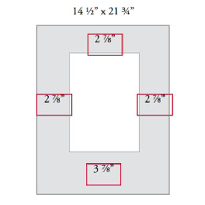
When a title or signature appears below the image, a small window may be necessary in the mat's bottom border. This will, of course, require the mat's bottom border to be wider. However, the oft repeated justification that art needs to "sit down in a frame" and "have a foundation" is suspect. Why does art have to sit down in a frame? To what end?"
The assumption seems to be that all art is representational. In other words, for this "sitting down in a frame" argument to make sense, the assumption appears to be that all art is a picture of something, and not abstract. What's more, there seems to be an assumption that when a picture is representational it probably includes a horizon line. A picture of a landscape, for example, is representational and it includes a horizon line. Such a picture would perhaps be enhanced by being made to sit down in the frame and have a foundation. But what about art that doesn't have a horizon line? What about aviation art or underwater images? And what about abstract art?
If you have ever seen abstract art in a mat with a wider bottom border, you may agree that the weighted border does nothing to enhance it. Abstract art, as a general thing, looks better in a mat with four borders the same. This may have to do with the fact that most abstract art does not have a horizon line. Forcing it to sit down in a frame runs counter to its uninhibited nature.
So we can say this: a wider bottom border is desirable in some cases, usually in those cases where the image is representational and has a distinct horizon line. But it is certainly not a blanket rule that can be applied to the matting of all artwork across the board.