Proportion is a relationship between various parts of a whole thing. Unless a person is an artist or a scientist, well-balanced visual proportion is something one sees rather than measures. It is a personal visual balance of light, color, texture, shape, and line. The proportions an individual feels most comfortable with are based on a lifetime of personal, cultural, and educational (both formal and informal) experiences.
In picture framing, the size of the matting is very important to the presentation of the art. Beginners typically choose narrow mat borders, thinking that a wider border might overwhelm the art. In fact, the opposite is often true, as narrow borders become stripes that can distract the viewer from focusing on the art.
In museums, very large mats are used, even on small pieces of art, to showcase the art itself. This style is frequently adopted when framing fine art for homes and offices. At first, these wide mat borders may look oversized, but as picture framers gain more experience, they usually start to prefer wider mats.
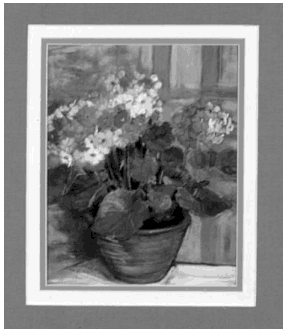
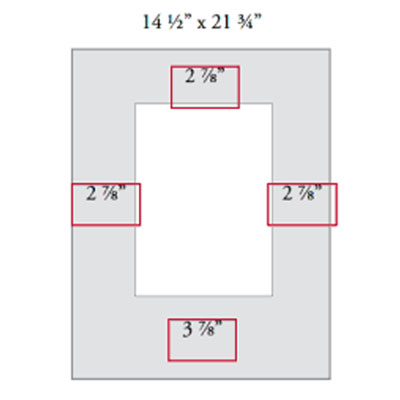
One traditional matting proportion is a wider bottom border. The top and sides are one size, and the bottom is either slightly wider or may be as much as several inches wider. There are a variety of theories about why this proportion is appealing to the human eye, including elements like gravity and natural proportions. For picture framing purposes it is enough to know that a heavier bottom mat border provides a comfortable balance for many viewers. It is commonly used on fine art and photography, and is often seen in museums.
Look at the examples on this page, and notice the differences created by adjusting the width of the borders. Experiment with wider mats, especially in neutral colors.